The Way to Wrap Flex Items is Grid
And finally it is still a workaround.

A Progress Bar Too Long
Recently, I've been tackling a layout issue of flex items. The problem is easy to describe,
The progress bar looks great when there are not that many items. But when you have "too many" steps, it could overlap. You may move the slider to see what it looks like when more steps added.
I may argue that it's definitely reasonable that no project is supposed to consist of that many steps, you should break you problem into smaller problems, blah blah...
But business is business, sometimes, thinking of reasonable circumstances is a skill, while using words like "too many" could be a sign of irresponsiblity.
A Common Case
Before tackling it, I want to point it out that this issue turns out to be realistic as I recalled that years ago one of my colleagues had brought it out when we were talking about his technical interview. I believe it has been a common case of flex items, there is even an article on MDN about Mastering wrapping of flex items.
If something overlaps, we have to wrap it. The problem is that flex can either wrap or auto-sizing(grow/shrink) the items as flex lines act like separated flex containers. When there are different numbers of items in rows, it either looks like this
.container {
    flex-wrap: wrap;
    justify-content: space-between;
    .item {
        flex: 1;
    }
}
Or this
.container {
    flex-wrap: wrap;
    justify-content: flex-start;
    .item {
        flex: 0;
    }
}
Try moving the slider to see the changes. Disgusting, right?
This problem could be a common case everywhere displaying lists of cards, like channels on Youtube/twitch, or goods on amazon. Look into the details you may find they are adapting their own ways to bypass this inevitable wrapping problem.

For Youtube, they used flex layout and specified the width of the cards with width: 210px. This is the most efficient way sacrificing the responsibility of the cards.
For twitch, they used flex layout and appended empty placeholders to the list. This is the solution I mentioned when my colleague brought out the quiz, but I was not that satisfied with it as it is unhygienic. Some would say it is a clever solution, some would say it is just a workaround in sake of vulnerability of flex layout.
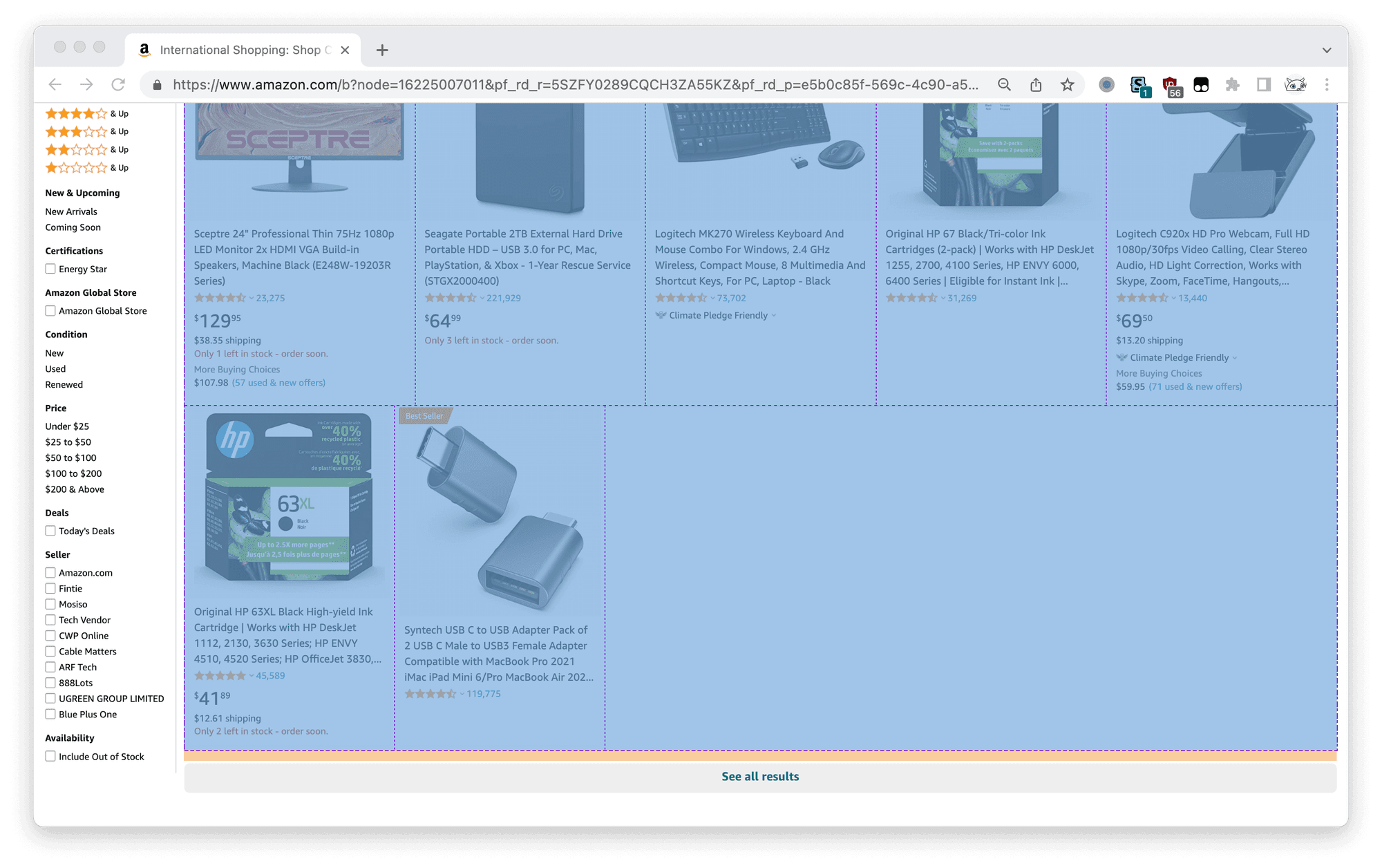
For amazon, it's like a mixtune. They attached an pseudo element to take over the space at the last row, which looks almost right but actually not lining up.
.apbSearchResultsContainer::after {
    content: "";
    flex-grow: 999;
}
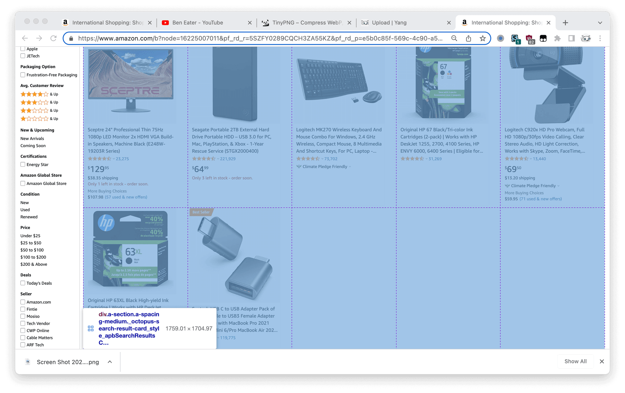
But it is trivial as a fallback, they used grid layout with auto-sizing columns repeat(auto-fill, minmax(320px, auto)) and looks very nice. According to caniuse above 96% of clients support grid layout.
@supports (display: grid) {
  .apbSearchResultsContainer {
    display: grid;
    grid-template-columns: repeat(auto-fill, minmax(320px, auto));
  }
}
Auto-sizing Columns
In the MDN document I mentioned before, it is pointed out that
This is the difference between one and two-dimensional layout. In a one dimensional method like flexbox, we only control the row or column. In two dimensional layout like grid we control both at the same time. If you want the space distribution row by row, use flexbox. If you don't, use Grid.
Amazon is on the right track! Can we just copy and hand it over? I'm afraid not.
.container {
    display: grid;
    grid-template-columns: repeat(auto-fill, minmax(1em, 1fr));
}
Looks no differences from what we got with flex .item {flex: 0}. For our circumstance, what we actually need is
The trick is that there is another kind of grid auto-sizing columns called auto-fit. You may check more details at an article from CSS-Triks Auto-Sizing Columns in CSS Grid: auto-fill vs auto-fit. In short,
auto-fillFILLS the row with as many columns as it can fit. So it creates implicit columns whenever a new column can fit, because it’s trying to FILL the row with as many columns as it can. The newly added columns can and may be empty, but they will still occupy a designated space in the row.
auto-fitFITS the CURRENTLY AVAILABLE columns into the space by expanding them so that they take up any available space. The browser does that after FILLING that extra space with extra columns (as withauto-fill) and then collapsing the empty ones.
The description FITS perfectly with what we want. Except the tail, as you can see, and now we will deal with it. In flex layout we added .item:last-of-type {flex: 0} to prevent its grow. In grid layout we could achieve this with grid-column-end.
.container {
    display: grid;
    grid-template-columns: repeat(auto-fit, minmax(1em, 1fr));
    .item:last-of-type {
        grid-column-end: none;
    }
}
It looks great, but when you add the items, you may find the problem, the last item in second row will stay at the end of row and even overlaps a column of the grid. It's starting to be annoying
The solution I adapted was a workaround
.container {
    display: grid;
    grid-template-columns: repeat(auto-fit, minmax(1em, 1fr));
    .item:last-of-type {
        grid-column-end: none;
        &:nth-child(n + 20) {
            grid-column-end: auto;
        }
    }
}
If the last item has at least 20 siblings, stop it staying at the end of the row. I will never be proud of the solution, but probably a tolerance under 5% is bearable, can you spot it before I point it out? Try moving the slider around 20 and watch the end of the row.
Is Grid Winning?
Yes but I wouldn't admit it. Flex layout is still powerful enough for most circumstances. The Achilles' Heel of grid layout is that it is, uh... too complex for beginners. I would always prefer flexbox except that there is issue flex incapable of, for example like metioned before, two dimentional layout.
